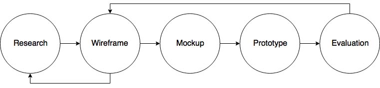
Development
UI Design, UX Research, Low Fidelity Design, High Fidelity Design, Prototyping, Usability Testing.
Tools
Photoshop, Marvelapp.
Date
2016
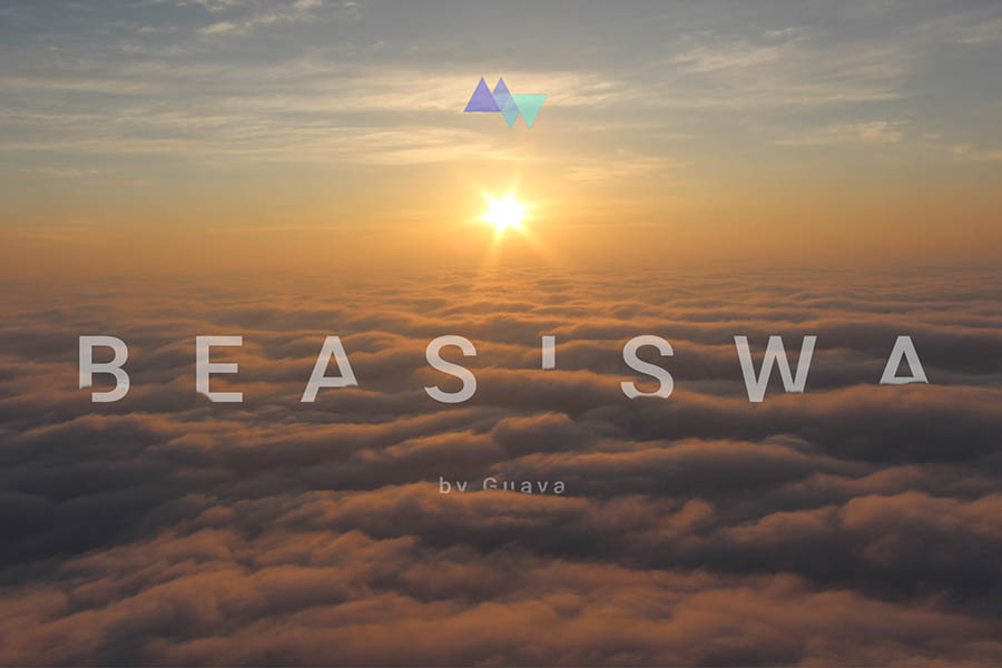
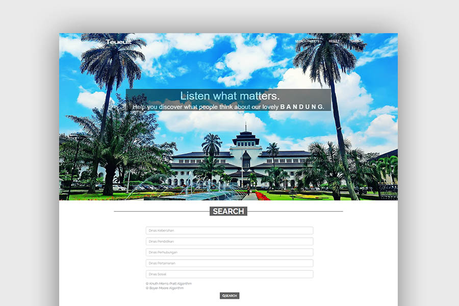
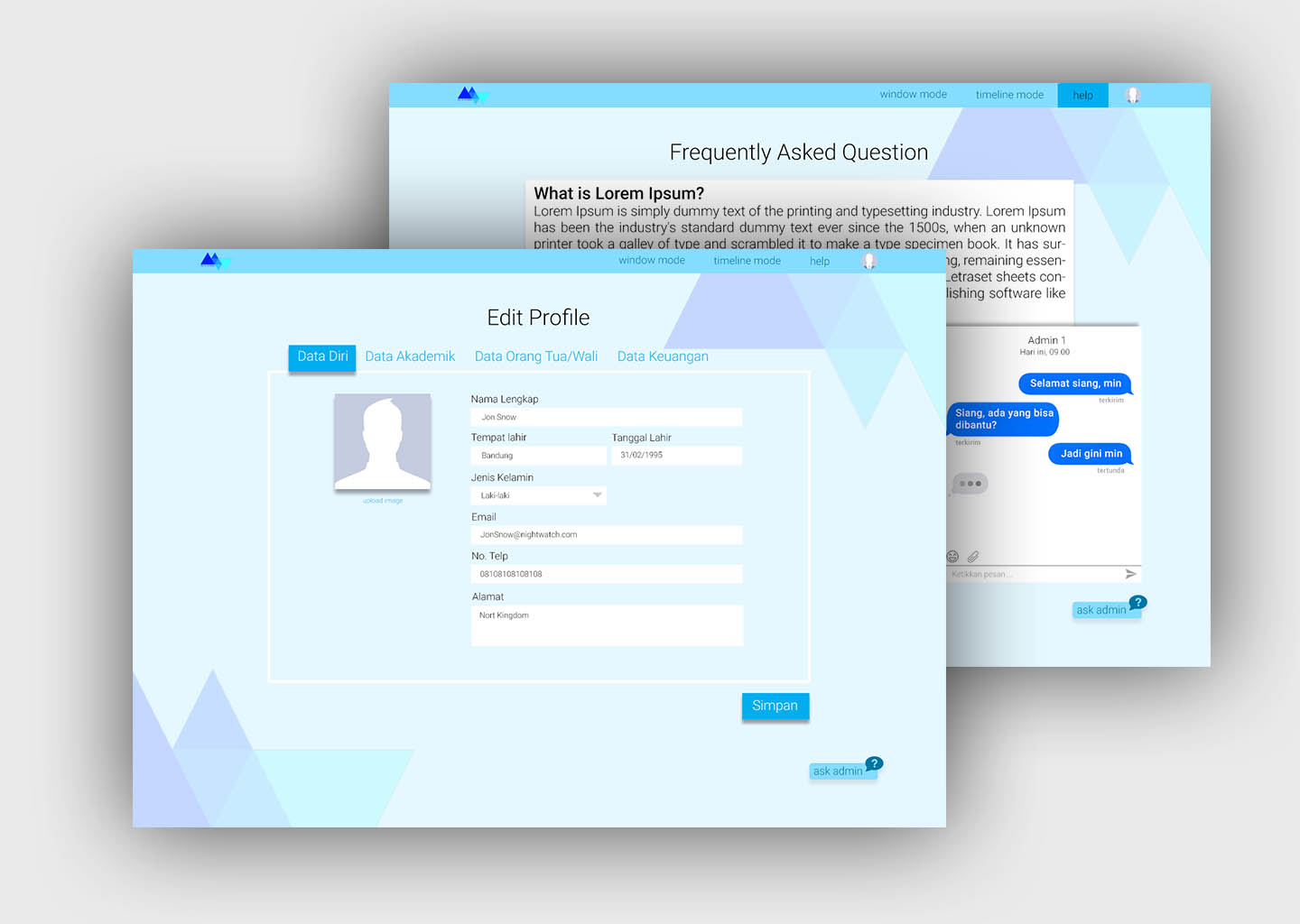
Be A Siswa is a mockup of a web application. This website is designed to provide information about scholarships for students who need it. Each scholarship on this website is displayed with a specific color (red, yellow, and green), which aims to mark the status of a scholarship within available, expires, or is in a period of selection. It is intended that users can more easily identify and distinguish each any scholarships displayed.
Applying for scholarships never been this easy.
Low Fidelity Design
The Process
The process begins with mapping between concepts and usability and user experience goals. From the results of the mapping then made preliminary design which is a rough idea of the website design that will be made. Followed by making low fidelity prototype and high fidelity prototype. We design high-fidelity prototypes using Photoshop to create the interface and Marvelapp to make the interaction between pages.
The next process is to perform usability testing directly to users and get feedback from them for further revisions to the creation of the final design.
High Fidelity Design
What I Learned
This project is the assignment for Human-Computer Interaction course. This is my first project where i learned about usability goal and user experience. By doing this project, I learned how to solve existing problems by paying attention to usability and user experience, gather data from users, and developing prototype.
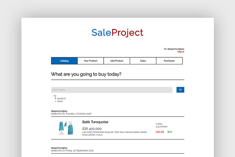
Sale Project
Role
Front-end Developer
Development
HTML, CSS, Javascript, Angular.js, AJAX, MySQL, Firebase, PHP, Web Service, JSP, Java Servlet, REST API.
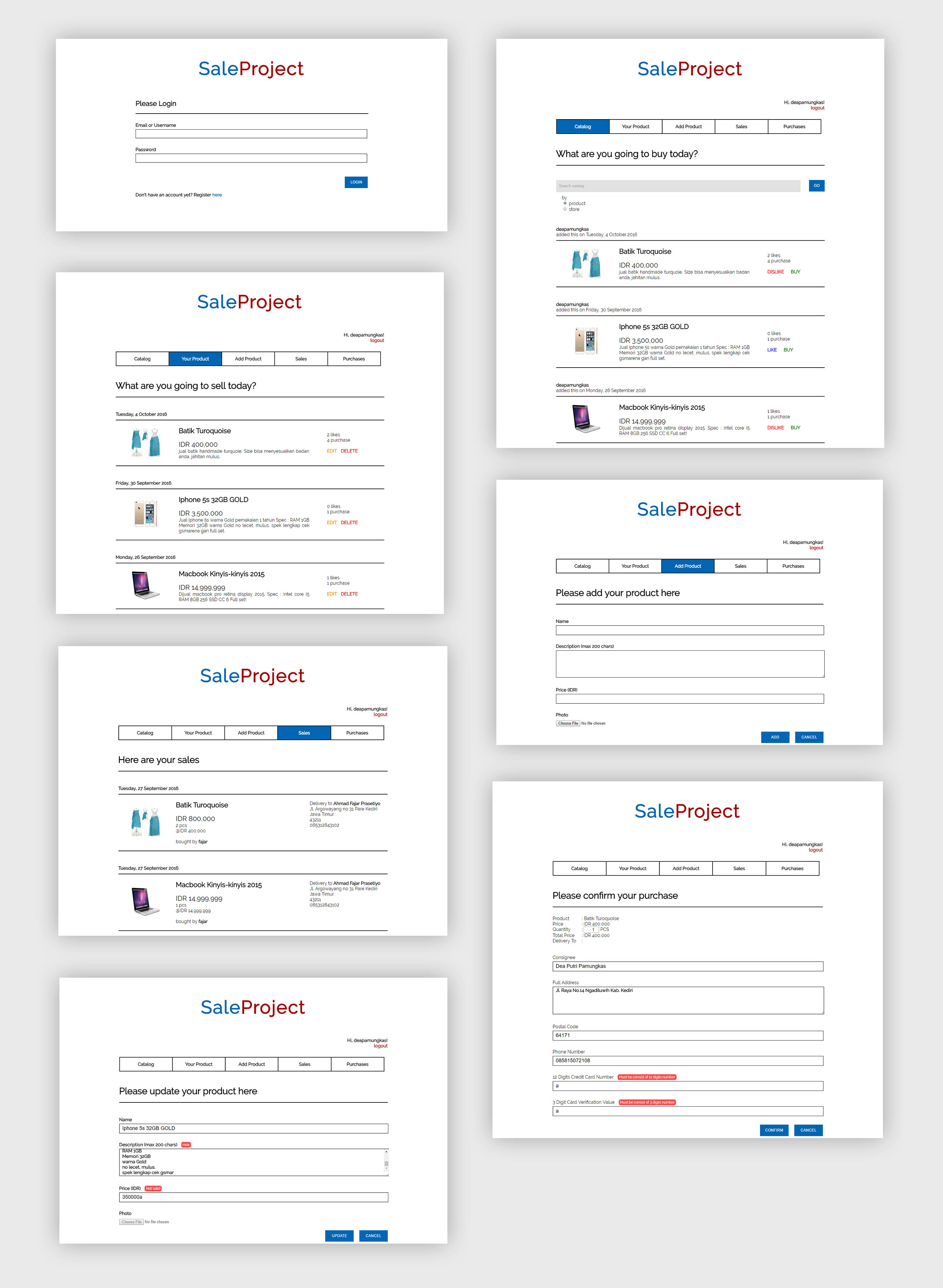
Sale Project is an e-commerce website that consists of buyer-side and seller-side with the feature login, logout, and register. The buyers can make a purchase of products. While the Sellers can upload their products including its photos and edit them at one time or maybe remove it.
Oh yes, there is also a chat feature that can be used for conversations between sellers and buyers.
The first phase of the development of Sale Project is to build it using HTML, CSS, Javascript for front-end, PHP for back-end and MySQL for the database. The second phase is to develop Sale Project using JSP, REST API, a Java Servlet. The last phase is to add a chat feature using Angular.js and Firebase.
The Interfaces
Interface of Sale Project
What I Learned
This project is the assignment for Web-based Application Development course. This is my first project where i learned about web development including web service, JSP, REST API, Java Applet and so on. By doing this project, my HTL-CSS-Javascript's skill become more develop and I learned new things about AJAX and Angular.JS. It's quite mind-blowing for the first time I used it.
Disclaimer : That simple interfaces are caused by we must meet the specifications defined by the lecturer which the interfaces must be identical to that exemplified by the lecturer. Thanks!
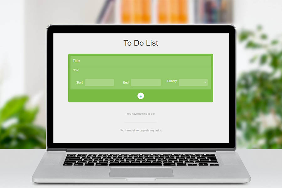
To Do List
Role
Developer
Development
HTML, CSS, Javascript.
Tools
Atom
Date
2017
To do list is a simple to do list made with HTML, CSS, Javascript. The interface is simple because it is a simple to do list. What can you do with this simple to do list? You can add your to-do activity, check it when it's done, delete it when you want to remove it, edit it when you make a mistake because humans are not infallible.
But wait! It will automatically save your to-do and complete activity so when you close your tab or browser and reopen it, it stils there!
By doing this project, my Javascript's skill become more develop and I learned new things about localStorage in HTML5. This feature will save the data in string into local storage browser, and will remain stored even if we close the tab or close the browser.
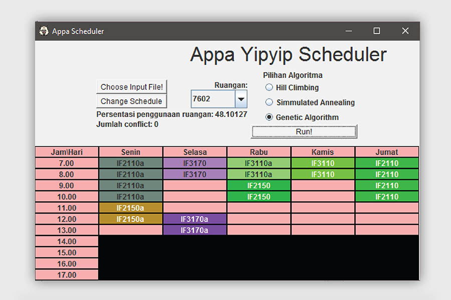
Appa Yipyip Scheduler
Role
Developer
Development
Hill Climbing, Simulated Annealing, Genetic Algorithm, Java
Appa Yipyip Scheduler is a course scheduling application developed in Java. It implements 3 local search algorithm : Hill Climbing, Simulated Annealing, and Genetic Algorithm. It reads a txt file which includes course time, rooms available, and the credits for each course. Appa Yipyip Scheduler then do the most optimum schedule based on certain constraints.
The interface of Appa Yipyip Scheduler was made with java swing. For your information, Appa is a fictional character in the animated television series Avatar: The Last Airbender. I that cartoon.
What I Learned
This project is the assignment for Artificial Intelligence course. This is my first project where i learned about AI which is currently growing rapidly in all industries. By doing this project, I just realized how great AI assist or even replace human tasks.
Teueuit
Role
Front-end, Back-end
Development
KMP Algorithm, Boyer-Moore Algorithm, Twitter API, Bootstrap, C#, ASP.NET
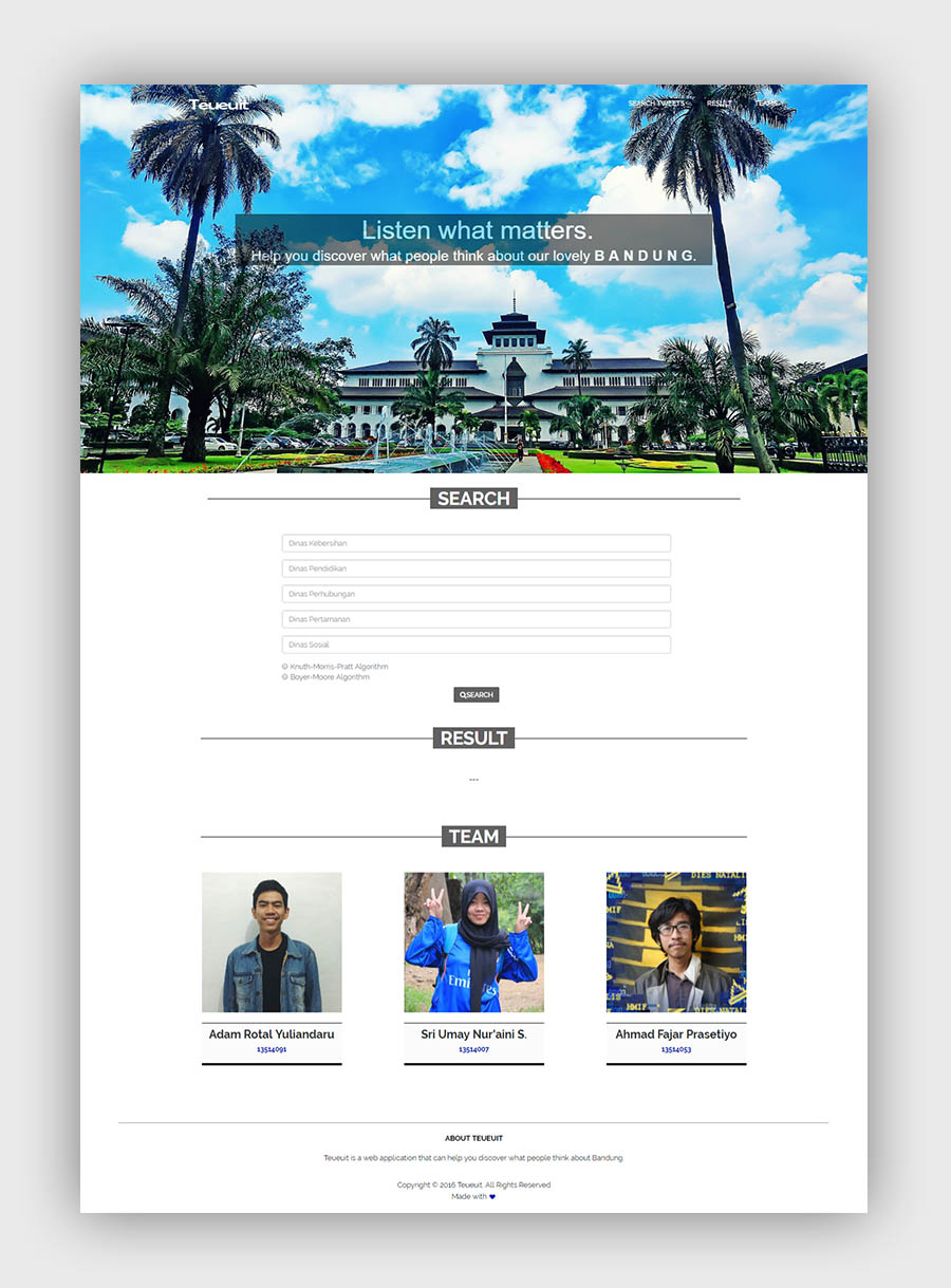
Teueuit is an web application that fetch tweets of Twitter's users in Bandung and dispose each tweets based on entered keyword. Teueuit will ask you to enter keywords regarding on each Department (Dinas) of Government of Kota Bandung. Teueuit was built on Visual Studio using ASP.NET and Bootstrap for the front-end and C# for the back-end using Twitter API.
Teueuit uses two popular string matching algorithms (KMP and Boyer-Moore) to match the keyword and store into each department.
What I Learned
This project is the assignment for Algorithm Strategy course. This is my first project where i used C# and Visual Studio to develop a web application. By doing this project, I learned how to crawl data from websites using effective algorithms.
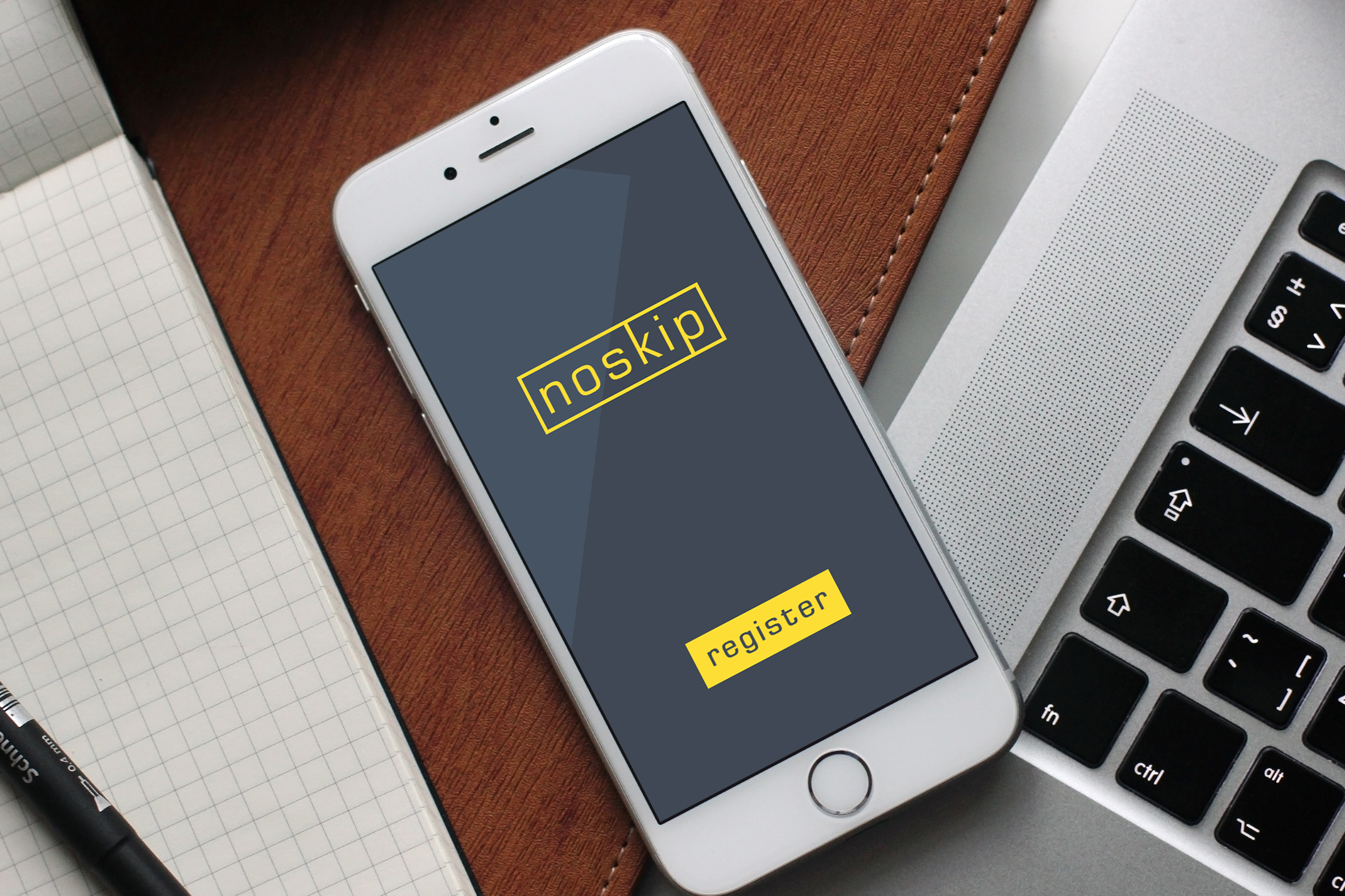
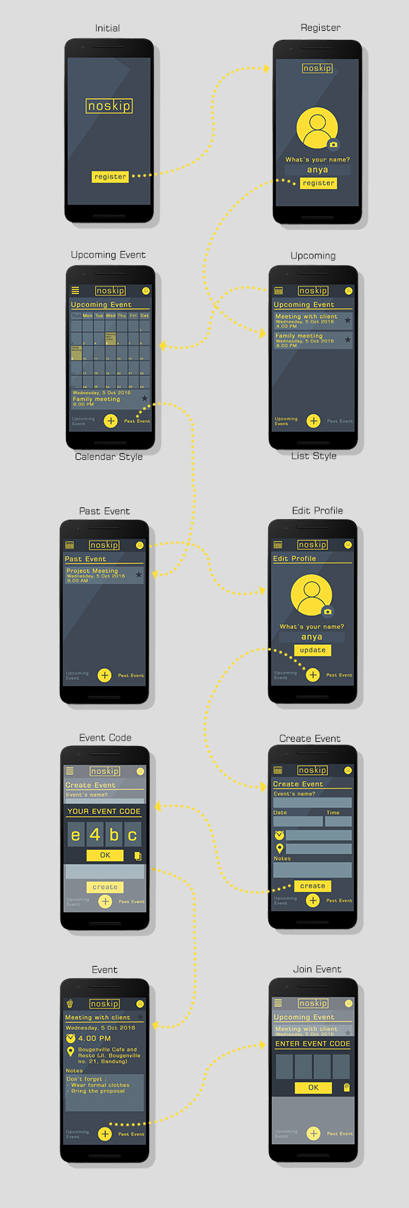
Noskip is a concept of an idea about integrated agenda. The idea comes from our disquiet about the number of people who often forget their appointments. This is often because they are too lazy to write an agenda on their calendars. Based on that story, we design an integrated application that is capable of adding an agenda with ease.
When you create an agenda in Noskip, the application will automatically generate a code that can be distributed to anyone who wants to add the agenda. This simple step allows users to add agenda and remind others.
The Interfaces
What I Learned
It is a project aimed to join a competition named IITIC 2016. By doing this project, I learned how to make a good proposal for an idea about app. Also by the end of this competition my team and I must present / pitch our idea in front of the judges.
Tokopedia Apps Revamp
Role
UX Designer
Tools
Photoshop, Balsamiq
Date
2017
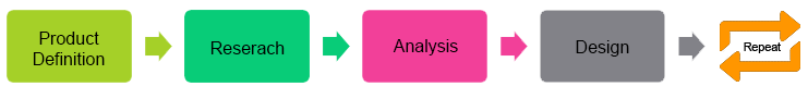
A few days ago I was challenged to revamp the UX of Tokopedia mobile apps on iOS platform. Fortunately, I accepted the challenge with no doubt. Although the processing time limit is short, I managed to apply UX design stages as follows:
How Was The Process?
Since the time given was really short, I only did one iteration of the process of this challenge. Nonetheless, it does not mean the solution offered is not the best solution because I had done every process in depth and sincerely.
This process started with the product definition including defining user needs, persona, and defining usability goal. Then I did the research that includes research on the current state of the Tokopedia app, competitor analysis to know the condition of Tokopedia's competitor, and literature research.
after that, I did the analysis according to the research. This analysis will produce pain point and opportunities offered to solve the paint point. The final process was design the wireframe of the solution.
Product Defition
User Needs
There are several user needs to be fulfilled on this project:
Accessing cart page (keranjang) from any pages.
Conducting transactions without creating any account.
Comparin two items.
The main proposed of user needs are to make them purchase more through this app.
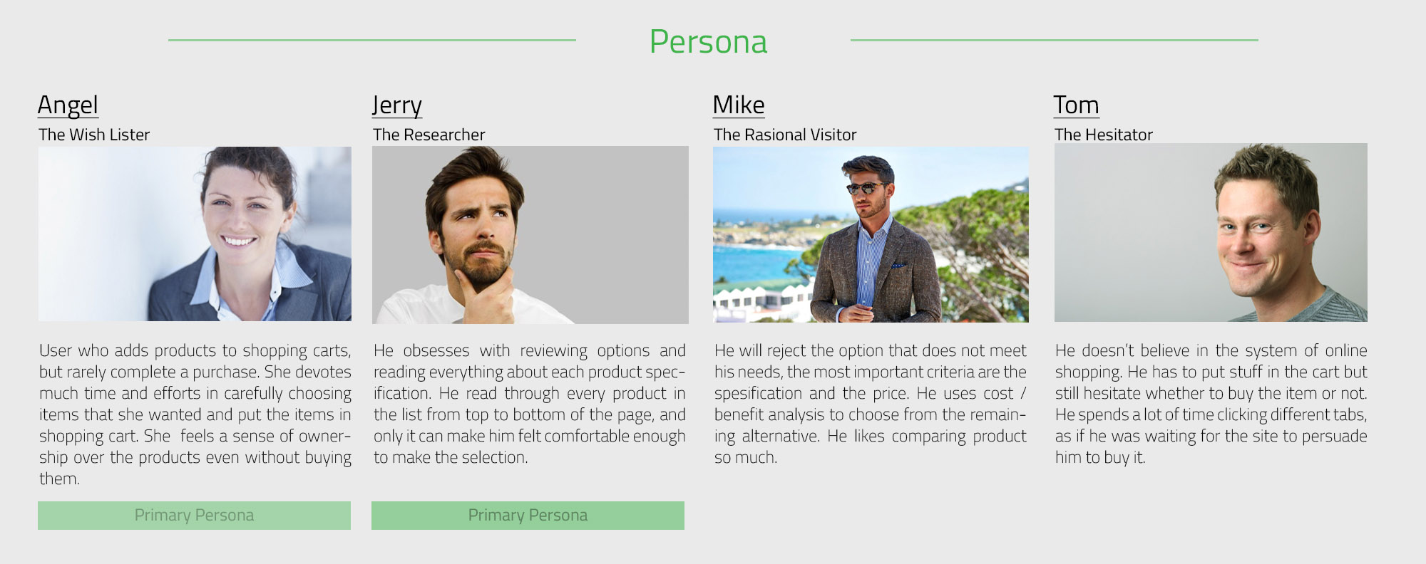
Persona
There are 4 personas used in this project.
Usability Goal
Effective : The app should arouse the user wishes to purchase the items.
Useful : This app should help user who confuce to choose the items.
Enjoyable : Users should feel comfortable when using this app without consider about time
Satisfying : This application must meet user expectations.
Research
After the product definition stage, I had to understand what users need and get ideas related to it. Then I can look for literature to support the idea and how well it's been implemented elsewhere. So that I can make projections about my ideas.
After that, I did a competitive analysis by comparing the ideas that I want to run with existing solutions. I compared the strong and weakness of each solution. Then, take the advantages of the ideas that will be run compared to existing solutions.
Analysis
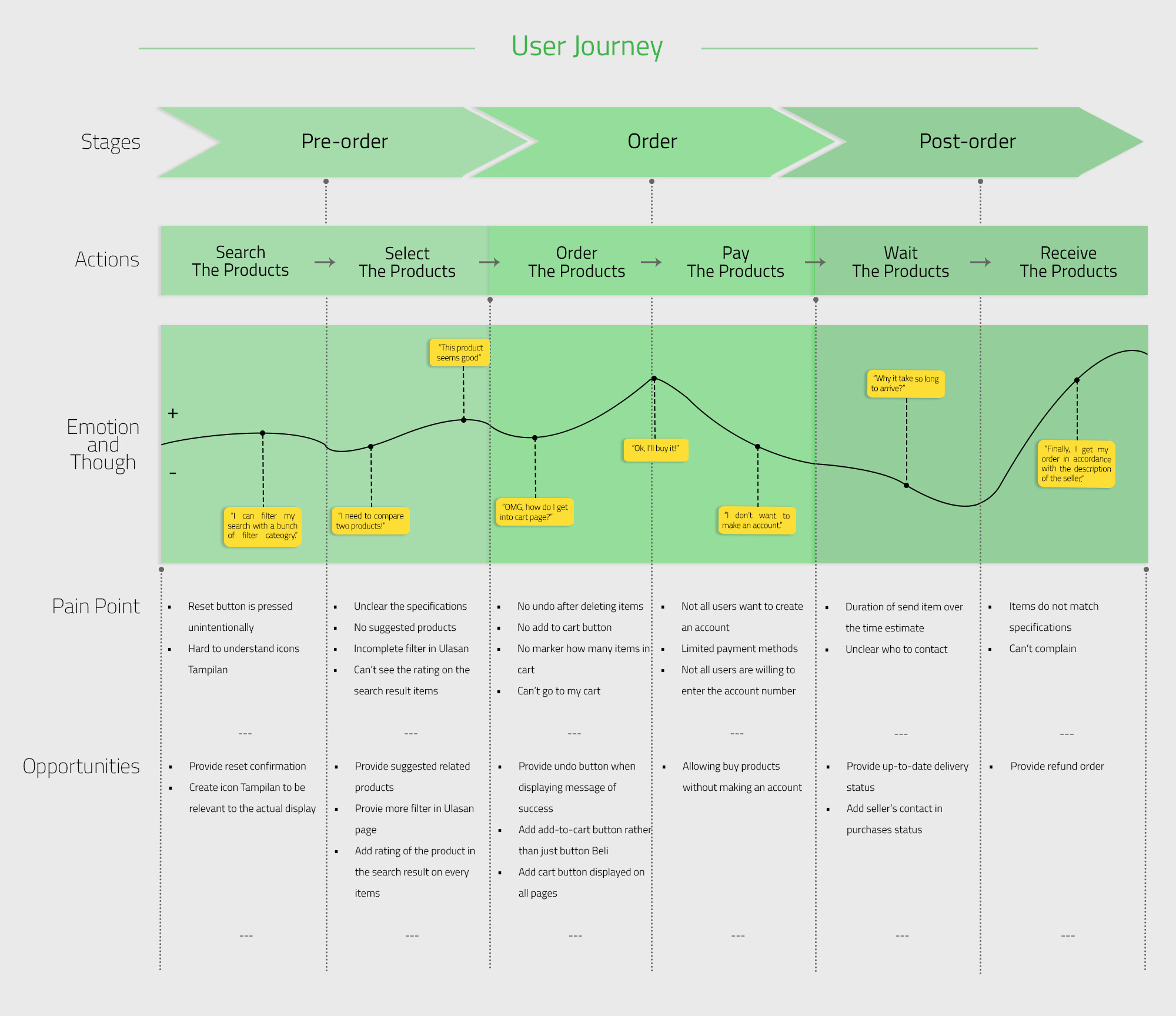
From the results of research and product definition, managed to created the user journey which includes the pain point for any actions or stages in the use of the existing app. In addition it also offered opportunities to improve existing pain points.
based on the opportunities offered, I decided to apply some of the ideas of this opportunity into the existing app. These additions include:
Laying the cart page icon on every page so that it can be accessed easily
Allowing to make a purchase without making an account.
Account page given additional information about the advantages when users create an account.
Adding a feature to compare two items.
Adding an undo button when a user deletes an item in the cart.
Displaying the rating in search results for each product so that users are more interested in choosing a product.
Providing suggestion products in every product that is opened by the users.
Eliminating process of entering account number on the payment process due to lowering the value of satisfaction.
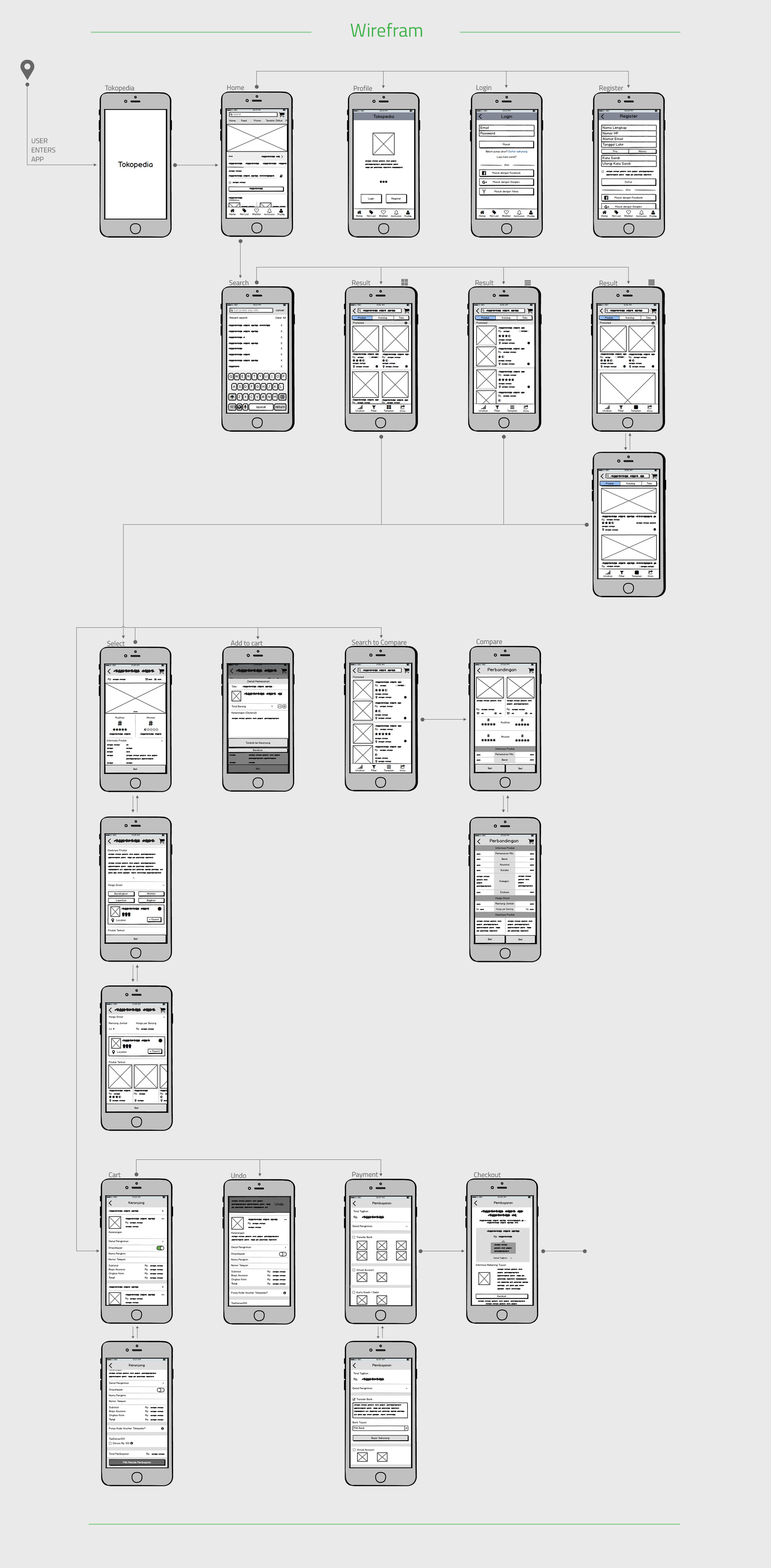
Design
The design of the wireframe created using Balsamiq applications based on sketches that I made earlier in the paper. Wireframe not made for all pages, only the page that change but still can describe UX flow of the registration process, login, search product, choose the product, buy products, and payment.
Potential for Development
The task execution is far from perfect. There are lot of shortcomings related to the process and methods used. Also there are many things that should be done so that the solution offered more relevant and reliable.
The process should be done iteratively instead done with one iteration without further process.
Persona-making process and user needs must be based on valid supporting data not based on literature and observation.
Wireframe that has been created should be done usability testing to users to get feedback from them and fix it on the next iteration.
What I Learned
To solve problems in UX design, we can not rule out the role of users in every process including gathering the insights until designing the app that fit with what users needed through usability testing. In the design process, it's necessary to make user journey to identify user pain point at every step and give some opportunities to solve that pain. By the end of this project / challenge, I know how much fun doing what an UX designer do. I should be thinking about what the users think, it's just like I walked into user's minds.
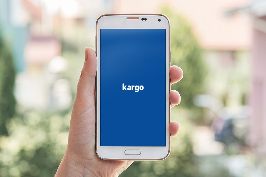
Shipment Monitoring App
Role
UI Designer
Tools
Photoshop
Date
2017
User Interface of a mobile application is part of the design which combines various activity including arts, colors, logics, and analysis. It makes an UI designer a kind of magician who has to combine the elements of layout in such way that would make using the mobile app easy, clear, fast, and pleasant. So, no doubt, UI Designer has responsibility demands a lot of knowledge, inspirations, and research.
Today's challenge is all about shipment monitoring through mobile apps: it presents the UI concept for shipment monitoring of Kargo.
Task
Design the interface of shipment monitoring across Indonesia on an android device including delivery position, estimation time, and documents.
Process
The process starts from defining the product. The company needs a mobile-based app that can monitor its delivery across Indonesia. They want to know the position of the truck delivery, delivery status, estimated time, and documents related to the shipment.
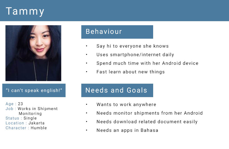
The next process is defining the persona. Persona is defined as an android user who does not get high enough education and only understands Bahasa Indonesia. For that application will be designed to use Bahasa entirely.
User Persona
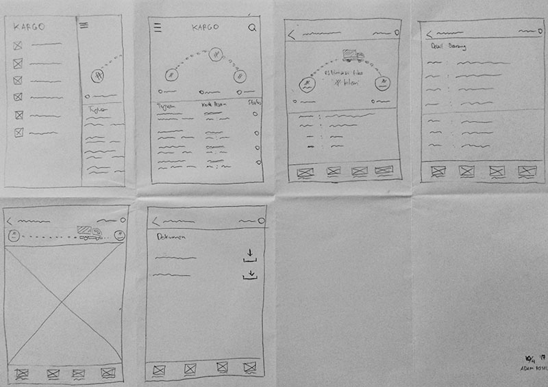
The process continues by doing wireframing on a piece of paper and forwarded to a high-level model using Photoshop. Wireframing with paper is selected because of short project time and it can speed up the process of collecting feedback from the user.
Low Fidelity Wireframes
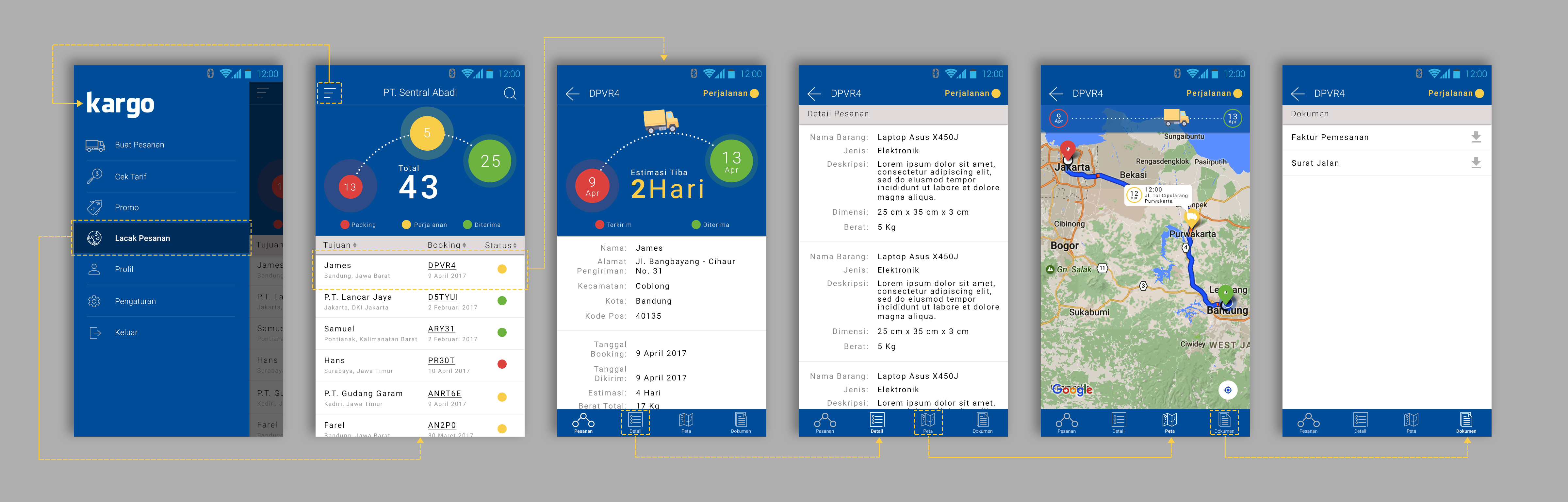
The first conception and stylistic decision for the design presented with the same color scheme with Kargo website.
I developed and designed 6 screens of different fungsionality:
Navigation screen
List of shipment page
Shipment order page (pesanan)
Detail shipment page (detail)
Shipping position page (peta)
Document page (dokumen)
Low Fidelity Wireframes
The interface has three circles of different colors indicating the delivery status. Red indicating packing process, yellow indicating delivery process, and green indicating the items have been received by the customer.
Interesting to pay attention to the details of these circles. The green circle is made larger and the yellow circle is placed not in the middle but closer to the green to give a sense of optimism to the user that the goods they send will arrive soon to the customer.
Another interesting thing about the interface I designed is on the map page. Under the navigation bar, there is an animated truck that will move towards the green circle as the truck goes. The animation had purely functional goal dealing with the details of the navigation and user experience of fast, highly informative and enjoyable.
What I Learned
To solve problems in UX design, we can not rule out the role of users in every process including gathering the insights until designing the app that fit with what users needed through usability testing. In the design process, it's necessary to make user journey to identify user pain point at every step and give some opportunities to solve that pain. By the end of this project / challenge, I know how much fun doing what an UX designer do. I should be thinking about what the users think, it's just like I walked into user's minds.
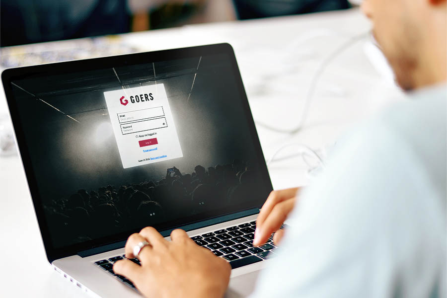
Goers Offline Selling
Role
UI/UX Designer
Tools
Balsamiq, Adobe Illustrator, Marvel
Date
2017
From May to August 2017, I did my summer internship as a UX Designer at P.T. Sanraya Adi Nataya or better known as Goers. Together with two intern developers, we were assigned to make offline ticketing system from scratch. This app is called Goers Offline Selling.
Task
Design the interface and the experience of Goers Offline Selling, a web application that is able to facilitate ticket sales through agents so that ticket sales can be done offline. The purpose of offline sales here is that the sale of the tickets made by face to face between the buyer and the seller who in this case is the agent. Payment methods facilitated in offline sales are cash or credit and debit cards. It also provides sales summary of the number of tickets sold and total revenue during the ticketing period. In addition, Goers Offline Selling can also facilitate the seller to track back the ticket sales data if necessary.
Process
The design process starts from analysis for the functional needs. The analysis is done to find out what information and features the user needs related to offline ticket sales. The analysis process is done by doing research on three things, Goers business process, stakeholder interviews, and field survey.
Research on business processes on Goers application is useful to know the flow of Goers applications that already exist now. This is done so that Offline Selling application can run in harmony with existing aplication and in accordance with existing business process.
After conducting business process analysis and knowing what features will be implemented in Goers Offline Selling, further research on the needs of stakeholders through interviews is done. Research at this stage aims to make the application in accordance with the needs and desires of stakeholders. From the stakeholders also known who the users of this application.
The latest research was conducted by conducting a field survey of the offline ticket sales process. Field surveys are useful for knowing offline ticket sales flow and the barriers that occur during the ticket sales process.
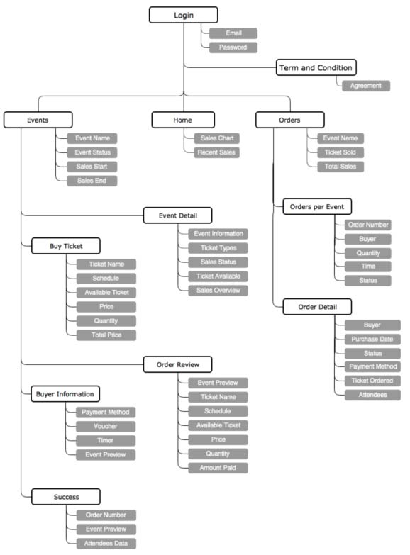
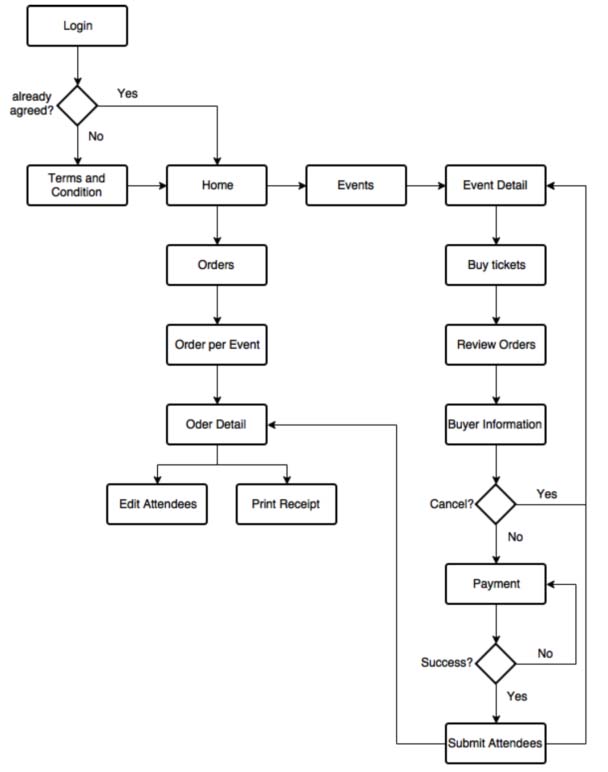
These researchs process produces an information architecture that describes what pages will be implemented and what information is contained in each page and user flow to make the flow as optimal as possible to create a better user experience.
Information Architecture of Goers Offline SellingUser Flow of Goers Offline Selling
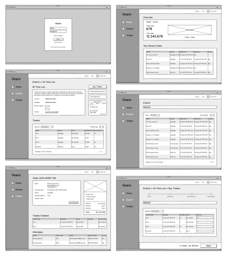
After knowing what pages should be there and also the flow of Goers Offline Selling, the next step is to design a wireframe. In the process of designing wireframe, used kakas making wireframe named Balsamiq. After the wireframe of a page has been completed, the wireframe is directly reviewed by Head of UI / UX to assess the composition of the content and its position if it is correct and appropriate. If the review process found there are things that are not appropriate then made a revision to be reviewed again until there is no shortage and ready to enter the design phase of the mockup.
Wireframes of Goers Offline Selling
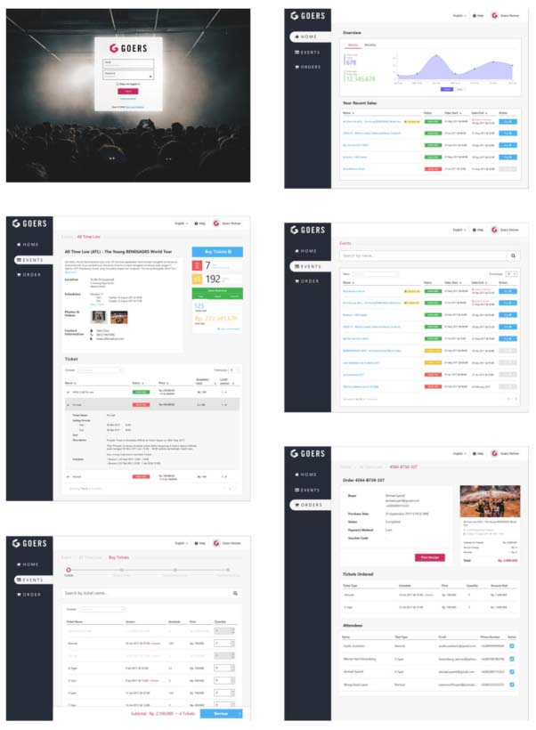
After the wireframe design is approved by Head of UI / UX, then mockups are made for each page. Mockup is used as a reference display that will be implemented by the team of developers.
The mockup design is made by following the Goers design guideline. This guideline contains rules on the use of color, size and shape of various components, type and font size, as well as the design of every states used by Goers. By making this guideline as a reference design, it is expected the user more easily menggunakaan application Goers Offline Selling because it has been familiar with existing designs. Aside from the guideline, in designing the mockup, benchmarking of various other application designs to gain inspiration and insight into the design of good applications.
The mockup design process uses Adobe Illustrator. Just like wireframes, the finished mockup will be reviewed by Head of UI / UX whether it is in compliance with the guidelines and meets functional and non-functional requirements. If deemed not appropriate, then made a revision for later review.
Wireframes of Goers Offline Selling
Mockup design results that have been reviewed and no revisions are then submitted to the team of developers using Zeplin's foot to be implemented.
What I Learned
From this internship, I learned how the science I get in the classroom can be applied in a real company, not just a case study. I learned how business processes and stakeholders should be taken into account when designing interface of an application in an existing company.
I learned also that communicating design and interaction that designers want to developers is not easy and need super intense communication. A designer must be clever to communicate what he wants and must know whether his design is feasible to be implemented or not.